On the internet you see the most incredible looks presented.
Most of them are black and shiny and very sophisticated.
There is one I like very much, but it/ s a mockup and not (yet) available.
But in fact I like a very quiet and friendly atmosphere on te desktop.
Everybody is bashing the standard Hardy Ubuntu look but I thinks itś not so bad at all.
It's clear and gives no distractions for the newcomer like me.
I had to disable Compiz as Ubuntu kept crashing because of it.
So I use Metacity as windowsmanager now and it's doing its job rather well.
Yesterday I activated the composite manager in Metacity and installed transet to create opaque or transparent windows. This is all foolishness and eye candy, but the looks are important.
Well to start with the LogIn Screen and the Lock up. The most beautiful theme for this I found was the New Wave theme. It so beautiful that I can't imagine it ever leaving it behind.

http://www.gnome-look.org/content/show.php/show.php?content=87370
To use the whole theme that looks very distinguished and sharp is th shiny and dark for my liking; too serious.
So I found an OSX look alike, Water Vapor; the fine thing with this theme that it's quiet, clear and very nice to use.
http://www.gnome-look.org/content/show.php/Water+Vapor?content=26980
But I'm running Ubuntu and not a Mac and I wanted the looks to express that.
So I found the Aquarius theme: http://art.gnome.org/themes/metacity/1324
and http://art.gnome.org/themes/gtk2/1325
The icons I choose are Gartoon: http://art.gnome.org/themes/icon/1001
The lettertype is Undotum 11 (window title 12) and the document font Dejavu Sans Book 11.
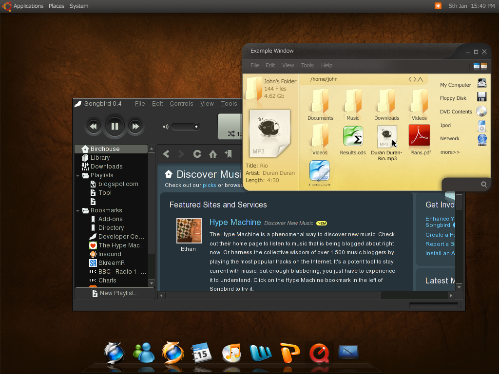
Here is a screenshot:

 Quickpost this image to Myspace, Digg, Facebook, and others!
No comments:
Post a Comment